336x280(권장), 300x250(권장), 250x250, 200x200 크기의 광고 코드만 넣을 수 있습니다.
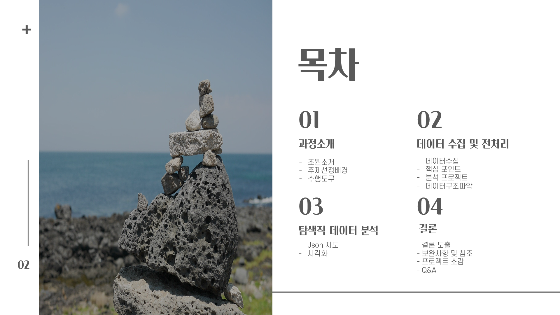
두번째 프로젝트 순서

프로젝트 마무리
매 10분마다 크롤링을 진행하고, 19시가 되면 이슈와 사설을 이메일로 보내준다. 자동화는 코드가 어디있는지 주섬주섬 다시 찾아봐야 한다 ㅠㅠ. 진행을 이슈파트 따로 사설파트 따로 해서, 사설은 어떤 식으로 코드 진행이 됐는지 잘 모르겠지만 나쁘지 않은 결과가 나왔다.
|
1
2
3
4
5
6
7
8
9
10
11
12
13
|
import os
from datetime import datetime
base_dir = 'C:/Workspace/project2_final/output/'
os.makedirs(base_dir, exist_ok=True)
from wordcloud import WordCloud
wc = WordCloud(font_path=r'C:\Windows\Fonts\MalgunBD.ttf',background_color="white",
max_words=150, max_font_size=300, width=800, height=800)
cloud = wc.generate_from_frequencies(dict(sum_search))
cloud.to_file(base_dir+'IssueKeyWord '+ datetime.today().strftime('%Y%m%d') + '.png')
|
cs |

하루 일정이 마무리 되면 실시간 TOP100개의 키워드와 언급된 게시물 조회수의 비중에 따라 워드클라우드를 생성한다.
|
1
2
3
4
5
6
7
8
9
10
11
12
13
14
15
|
#### 상위 5개 키워드 ####
df = pd.read_excel(path2, header=[0,1], index_col=[0] )
df_col = list(df.columns.levels[0])
hit_top5 = []
for i in df_col :
hit_max = df[i,'조회수'].max()
hit_top5.append(hit_max)
hit_dict = dict(zip(df_col,hit_top5)) #딕셔너리 값으로 저장
keyword_top5 = sorted(hit_dict, key=hit_dict.get, reverse = True)[:5] #탑 5개 keyword 추출
print(keyword_top5)
|
cs |

|
1
2
3
4
5
6
7
8
9
10
11
12
13
14
15
16
17
18
19
20
21
22
23
24
25
26
27
28
29
30
31
32
33
34
35
36
37
38
39
40
41
42
43
44
45
46
47
|
#### 19시에 코드 보내기
import matplotlib.pyplot as plt
import seaborn as sns
title_font = {'fontsize': 16, 'fontweight': 'bold'}
plt.rc('font',family='Malgun Gothic')
plt.figure(figsize=[20,10])
plt.style.use('ggplot')
plt.show(block=False)
plt.pause(1)
plt.close()
ymd = today.strftime('%Y-%m-%d')
hms = '19:00:00'
if hms == '19:00:00':
path_png = "C:/Workspace/project2_final/output/graphs"
if not os.path.isdir(path_png):
os.mkdir(path_png)
path_date = f"C:/Workspace/project2_final/output/graphs/{ymd}"
if not os.path.isdir(path_date):
os.mkdir(path_date)
##### 그래프 조회수 변동 ######
for i in keyword_top5 :
plt.title (f"키워드 : '{i}' 조회수 변동", fontsize=20)
df.index,df[i,'조회수'].plot( kind='bar')
# plt.bar(df.index,df[i,'조회수'])
#plt.show()
plt.savefig(f'{path_date}/조회수변동-({i}).png', bbox_inches='tight')
plt.close()
#.plot( kind='bar')
##### 그래프 키워드 관심도 #####
for i in keyword_top5 :
text =f'{i} 키워드 관심도'
sub_keys = df[i].groupby(['서브키워드'])['조회수'].mean().sort_values()
plt.title(text, fontdict=title_font, loc='center', pad= 20)
sub_keys.plot(kind='pie', autopct = '%1.1f%%', shadow = True, startangle=110 )
#plt.show()
plt.savefig(f'{path_date}/관심도-({i}).png')
plt.close()
print('그래프 시각화 완료')
|
cs |

19시가 되면 조회수 변동, 키워드에 따른 서브 키워드가 얼마나 변했는지 확인할 수 있다. 이거는 강의실에 와서 발표전 30분 데이터를 취합해서 만든 것이라 서브 키워드 변동도 거의 없고, 조회수 변동폭도 크지 않음을 확인할 수 있다.

|
1
2
3
4
5
6
7
8
9
10
11
12
13
14
15
16
17
18
19
20
21
22
23
24
25
26
27
28
29
30
31
32
33
34
35
36
37
38
39
40
41
42
43
44
45
46
47
48
49
50
51
52
53
54
55
56
57
|
import smtplib
from email.mime.multipart import MIMEMultipart;
# 메일의 본문 내용을 만드는 모듈
from email.mime.text import MIMEText;
# 메일의 첨부 파일을 base64 형식으로 변환
from email.mime.application import MIMEApplication;
# 메일의 이미지 파일을 base64 형식으로 변환(Content-ID 생성)
from email.mime.image import MIMEImage;
# 메일의 음악 파일을 base64 형식으로 변환(Content-ID 생성)
from email.mime.audio import MIMEAudio;
# 파일 IO
import io;
# 메일 서버와 통신하기 전에 메시지를 만든다.
data = MIMEMultipart();
# 송신자 설정
data['From'] = "본인의 이메일";
# 수신자 설정 (복수는 콤마 구분이다.)
data['To'] = "이메일1","이메일2";
# 메일 제목
data['Subject'] = "제목"
with open("C:\\workspace\\project2_final\\mailsource\\hi.png", 'rb') as fp:
img = MIMEImage(fp.read(), Name = "hi.png")
img.add_header('Content-ID', '<hi>')
data.attach(img)
with open("C:\\workspace\\project2_final\\mailsource\\issue.png", 'rb') as fp:
img = MIMEImage(fp.read(), Name = "issue.png")
img.add_header('Content-ID', '<issue>')
data.attach(img)
with open("C:\\workspace\\project2_final\\mailsource\\news.png", 'rb') as fp:
img = MIMEImage(fp.read(), Name = "news.png")
img.add_header('Content-ID', '<news>')
data.attach(img)
with open("C:\\workspace\\project2_final\\mailsource\\tw.png", 'rb') as fp:
img = MIMEImage(fp.read(), Name = "tw.png")
img.add_header('Content-ID', '<tw>')
data.attach(img)
with open("C:\\workspace\\project2_final\\mailsource\\fb.png", 'rb') as fp:
img = MIMEImage(fp.read(), Name = "fb.png")
img.add_header('Content-ID', '<fb>')
data.attach(img)
with open("C:\\workspace\\project2_final\\output\\IssueKeyWord {}.png".format(datetime.today().strftime('%Y%m%d')), 'rb') as fp:
img = MIMEImage(fp.read(), Name = "wc1.png")
img.add_header('Content-ID', '<wc1>')
data.attach(img)
with open("C:\\workspace\\project2_final\\output\\KeyWord {}.png".format(datetime.today().strftime('%Y%m%d')), 'rb') as fp:
img = MIMEImage(fp.read(), Name = "wc2.png")
img.add_header('Content-ID', '<wc2>')
data.attach(img)
|
cs |
|
1
2
3
4
5
6
7
8
9
10
11
12
13
14
15
16
17
18
19
20
21
22
23
24
25
26
27
28
29
30
31
32
33
34
35
36
37
38
39
40
41
42
43
44
45
46
47
48
49
50
51
52
53
54
55
56
57
58
59
60
61
62
63
64
65
66
67
68
69
70
71
72
73
74
75
76
77
78
79
80
81
82
83
84
85
86
87
88
89
90
91
92
93
94
95
96
97
98
99
100
101
102
103
104
105
106
107
108
109
110
111
112
113
114
115
116
117
118
119
120
121
122
123
124
125
126
127
128
129
130
131
132
133
134
135
136
137
138
139
140
141
142
143
144
145
146
147
148
149
150
151
152
153
154
155
156
157
158
159
160
161
162
163
164
165
166
167
168
169
170
171
172
173
174
175
176
177
178
179
180
181
182
183
184
185
186
187
188
189
190
191
192
193
194
195
196
197
198
199
200
201
202
203
204
205
206
|
# Html 형식의 본문 내용 (cid로 이미 첨부 파일을 링크했다.)
html = """
<!DOCTYPE html PUBLIC "-//W3C//DTD XHTML 1.0 Transitional//EN" "http://www.w3.org/TR/xhtml1/DTD/xhtml1-transitional.dtd">
<html xmlns="http://www.w3.org/1999/xhtml">
<head>
<meta http-equiv="Content-Type" content="text/html; charset=UTF-8" />
<title>하루 이슈</title>
<meta name="viewport" content="width=device-width, initial-scale=1.0"/>
</head>
<body style="margin: 0; padding: 0;">
<table align="center" border="0" cellpadding="0" cellspacing="0" width="600" style="border: 1px solid #cccccc;">
<tr>
<td align="center" bgcolor="#bdd7ee" style="padding: 40px 0 30px 0;">
<img src="cid:hi" alt="Creating Email Magic" width="600" height="380" style="display: block;" />
</td>
</tr>
<tr>
<td bgcolor="#ffffff" style="padding: 40px 30px 40px 30px;">
<table border="0" cellpadding="0" cellspacing="0" width="100%">
<tr>
<td font-family: 'Noto Sans KR', sans-serif;>
<table border="0" cellpadding="0" cellspacing="0" width="100%">
<tr>
<td width="260" valign="top" font-family:Noto Sans KR, sans-serif; font-size: 16px; line-height: 20px;">
<h2>커뮤니티 인기 키워드 100</h2>
<img src="cid:wc1" alt="Creating Email Magic" width="250" height="250" style="display: block;" />
</td>
<td style="font-size: 0; line-height: 0;" width="20">
</td>
<td width="260" valign="top" font-family:Noto Sans KR, sans-serif; font-size: 16px; line-height: 20px;">
<h2>사설 주요 키워드 100</h2>
<img src="cid:wc2" alt="Creating Email Magic" width="250" height="250" style="display: block;" />
</td>
</tr>
</table>
</td>
</tr>
<tr>
<td style="padding: 20px 0 30px 0; font-family:Noto Sans KR, sans-serif; font-size: 16px; line-height: 20px;">
<p>오늘 하루도 수고하셨습니다. 하이와 함께 행복한 하루를 마무리하세요!</p>
<br>
<br>
</td>
</tr>
<tr>
<td>
<table border="0" cellpadding="0" cellspacing="0" width="100%">
<tr>
<td width="260" valign="top">
<table border="0" cellpadding="0" cellspacing="0" width="100%">
<tr>
<td bgcolor="#3B89A3" align="center" style="padding: 20px 30px 20px 30px;">
<img src="cid:issue" alt="" width="50%" height="100" style="display: block;" />
</td>
</tr>
<tr>
<td style="padding: 10px 0 30px 0; font-family:Noto Sans KR, sans-serif; font-size: 16px; line-height: 20px;">
<h3 style="font-family:Noto Sans KR, sans-serif;">오늘의 커뮤니티 인기 키워드</h3>
<details><p style="line-height:180%">{1}</p>
<summary>{0}
</summary>
</details>
<br>
<details><p style="line-height:180%">{3}</p>
<summary>{2}
</summary>
</details>
<br>
<details><p style="line-height:180%">{5}</p>
<summary>{4}
</summary>
</details>
<br>
<details><p style="line-height:180%">{7}</p>
<summary>{6}
</summary>
</details>
<br>
<details><p style="line-height:180%">{9}</p>
<summary>{8}
</summary>
</details>
</td>
</tr>
</table>
</td>
<td style="font-size: 0; line-height: 0;" width="20">
</td>
<td width="260" valign="top">
<table border="0" cellpadding="0" cellspacing="0" width="100%">
<tr>
<td bgcolor="#3B89A3" align="center" style="padding: 20px 30px 20px 30px;">
<img src="cid:news" alt="" width="50%" height="100" style="display: block;" />
</td>
</tr>
<tr>
<td style="padding: 10px 0 30px 0; font-family:Noto Sans KR, sans-serif; font-size: 16px; line-height: 20px;">
<h3 style="font-family:Noto Sans KR, sans-serif;">오늘의 사설 주요 키워드</h3>
<details><p style="line-height:180%">{11}</p>
<summary>{10}
</summary>
</details>
<br>
<details><p style="line-height:180%">{13}</p>
<summary>{12}
</summary>
</details>
<br>
<details><p style="line-height:180%">{15}</p>
<summary>{14}
</summary>
</details>
<br>
<details><p style="line-height:180%">{16}</p>
<summary>오늘 자주 등장한 키워드
</summary>
</details>
</td>
</tr>
</table>
</td>
</tr>
</table>
</td>
</tr>
</table>
</td>
</tr>
<tr>
<td bgcolor="#bdd7ee" style="padding: 30px 30px 30px 30px;">
<table border="0" cellpadding="0" cellspacing="0" width="100%">
<tr>
<td width="75%"; style="color: #000000; font-family: Arial, sans-serif; font-size: 14px;">
® 하루이슈, Hi 2021<br/>
<a href="" style="color: #000000;"><font color="#000000">Unsubscribe</font></a> to this newsletter instantly
</td>
<td align="right">
<table border="0" cellpadding="0" cellspacing="0">
<tr>
<td>
<a href="http://www.twitter.com/">
<img src="cid:tw" alt="Twitter" width="38" height="38" style="display: block;" border="0" />
</a>
</td>
<td style="font-size: 0; line-height: 0;" width="20"> </td>
<td>
<a href="http://www.facebook.com/">
<img src="cid:fb" alt="Facebook" width="38" height="38" style="display: block;" border="0" />
</a>
</td>
</tr>
</table>
</td>
</tr>
</table>
</td>
</tr>
</table>
</body>
</html>
""".format(keyword_top5[0], articlestr1, keyword_top5[1], articlestr2, keyword_top5[2], articlestr3, keyword_top5[3], articlestr4, keyword_top5[4], articlestr5, sendingKeywords[0], content1, sendingKeywords[1], content2, sendingKeywords[2], content3, dfCSV["text"].tolist())
msg = MIMEText(html, 'html')
# 메시지를 확인한다.
# Data 영역의 메시지에 바운더리 추가
data.attach(msg);
print(data);
# 메일 서버와 telnet 통신 개시
server = smtplib.SMTP_SSL('smtp.naver.com',465);
#server = smtplib.SMTP('smtp.gmail.com',587);
# 메일 통신시 디버그
server.set_debuglevel(1);
# 헤로 한번 해주자.(의미 없음)
server.ehlo();
# tls 설정 주문 - tls 587 포트의 경우
#server.starttls();
# 헤로 또 해주자.(의미 없음)
server.ehlo();
# 로그인 한다.
server.login("ID", "P/W!"); # 아이디, 패스워드 입력
# 심심하니 또 헤로 해주자.(의미 없음)
server.ehlo();
# MAIL(송신자) 설정
sender = data['From'];
# RCPT(수신자), 리스트로 보낸다.
# 수신자 추가
receiver = data['To'].split(",");
# # 참조자 추가
# if data['Cc'] is not None:
# receiver += data['Cc'].split(",");
# # 숨은 참조자 추가
# if data['Bcc'] is not None:
# receiver += data['Bcc'].split(",");
# 메일 프로토콜 상 MAIL, RCPT, DATA 순으로 메시지를 보내야 하는데 이걸 sendmail함수에서 자동으로 해준다.
server.sendmail(sender, receiver, data.as_string());
# QUIT을 보내고 접속을 종료하고 메일을 보낸다.
server.quit();
|
cs |
'도전하자. 프로젝트' 카테고리의 다른 글
| 3-2 파이썬 팀프로젝트 CNN 모델링 - 인공지능, 머신러닝, 딥러닝 뭔데? (0) | 2021.08.01 |
|---|---|
| 3-1 파이썬 팀프로젝트 CNN 식물 병충해 분류 (0) | 2021.07.31 |
| 2-3 파이썬 팀프로젝트 : 데이터 저장, 판다스 열/행 관련 총정리 + 폴더/파일 생성 (0) | 2021.07.18 |
| 2-2 파이썬 프로젝트 : BS4 웹크롤링, 형태소 분석, (0) | 2021.07.17 |
| 2-1 파이썬 팀프로젝트 : 네이버 실시간검색 대체 이슈 예측 기획 (0) | 2021.07.16 |